
|
THE DATA IN GRAPHICS
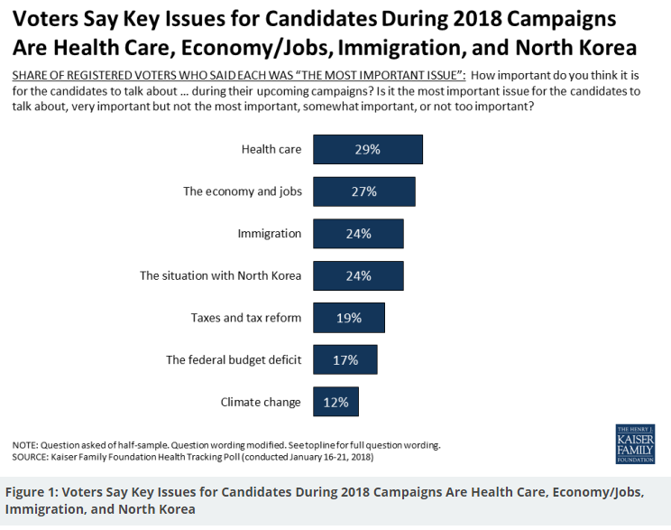
During first quarter of this year (2018), Kaiser Family Foundation launched a new tool for all available health insurance and healthcare data. Their website has been always a good source, but now it is enriched with many surveys. Making graphics from it gives large and transparent views for many general changes established after ACA come in force. Everybody can access Kaiser Family Foundation tool and let numbers talk themselves. Below are graphic interpretations for much of this valuable data.
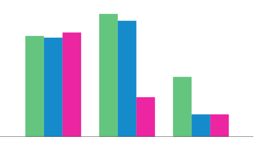
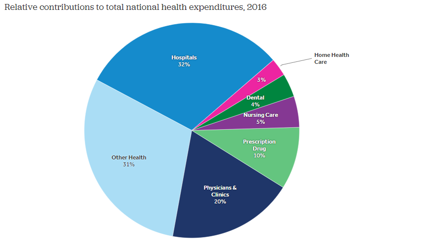
Per enrollee spending growth has slowed recently for all major payers Private Insurance Medicare Medicaid 1990s 2000s 2010-2016 Hospital and physician services represent half of total health spending
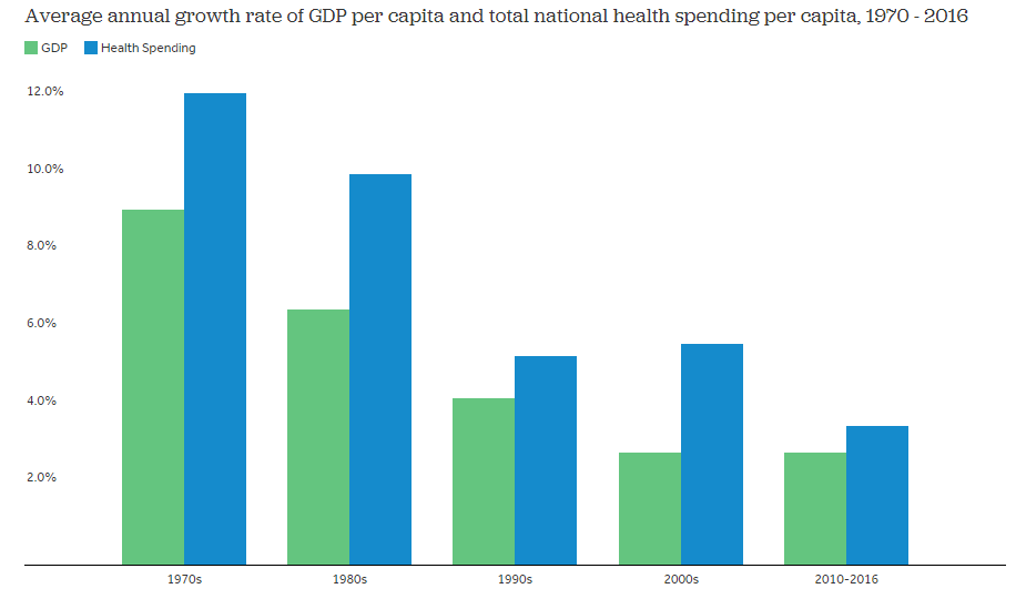
Health spending growth has slowed, and is now more on pace with economic growth
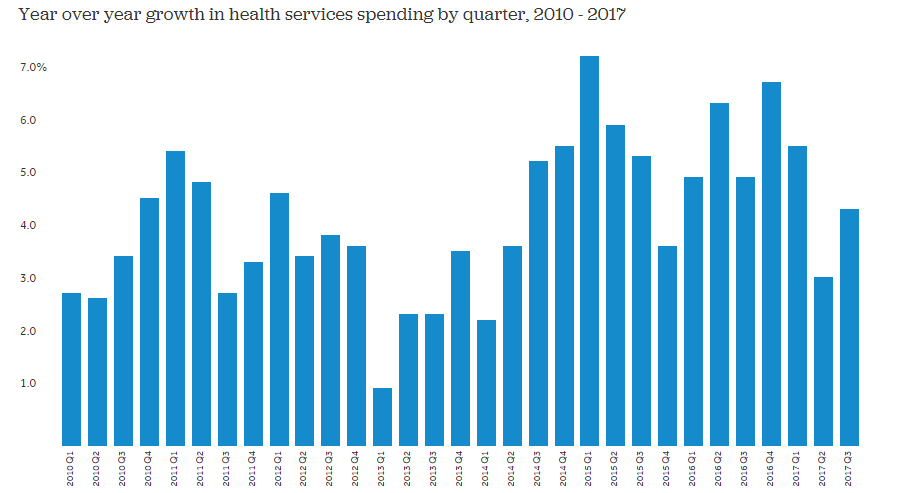
Health services spending growth slowed a bit in recent quarters
Spending on public health has increased, particularly by state and local governments
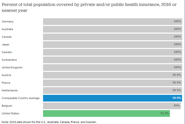
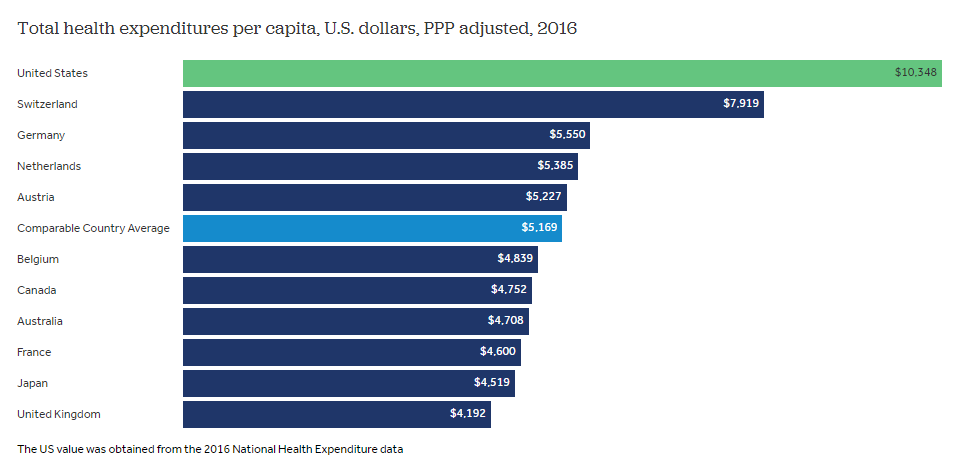
On average, other wealthy countries spend about half as much per person on health than the U.S. spends
While the U.S. has similar public spending, its private sector spending is triple that of comparable countries While the U.S. has much higher total spending as a share of its economy, its public expenditures alone are in line with other countries. In 2016, the US spent about 8.5% of its GDP on health out of public funds –essentially equivalent to the average of the other comparable countries. However, private spending in the U.S. is much higher than any comparable country; 8.8% of GDP in the U.S., compared to 2.7% on average for other nations.
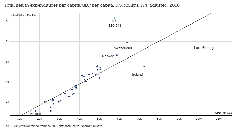
Relative to the size of its wealth, the U.S. spends a disproportionate amount on health care
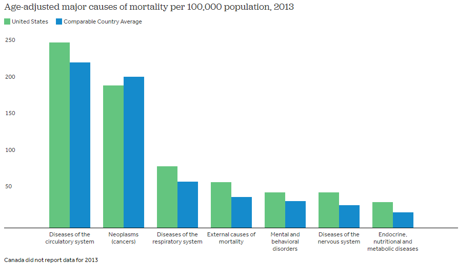
For most of the leading causes of death, mortality rates are higher in the U.S. than in comparable countries
Has your teenager made the safe driving promise yet? The heart of the I Promise Program is the Parent-Youth Safe Driving Contract - developed with the input of teens, parents, police, traffic safety experts and researchers. Each day teenagers die in car crashes. However, many parents feel they "trust" their teen and so, do not need to complete a safe driving contract.
|

 Highway Loss Data Institute Information on car theft, collision and injury listed by car make, model and year. Also contains extensive highway safety tips and information. http://www.carsafety.org/
  Insurance Institute for Highway Safety Excellent information and sobering statistics on automobile safety. http://www.hwysafety.org/
 |
|

issue 20022

issue 2021-2022

issue 2021-2022